
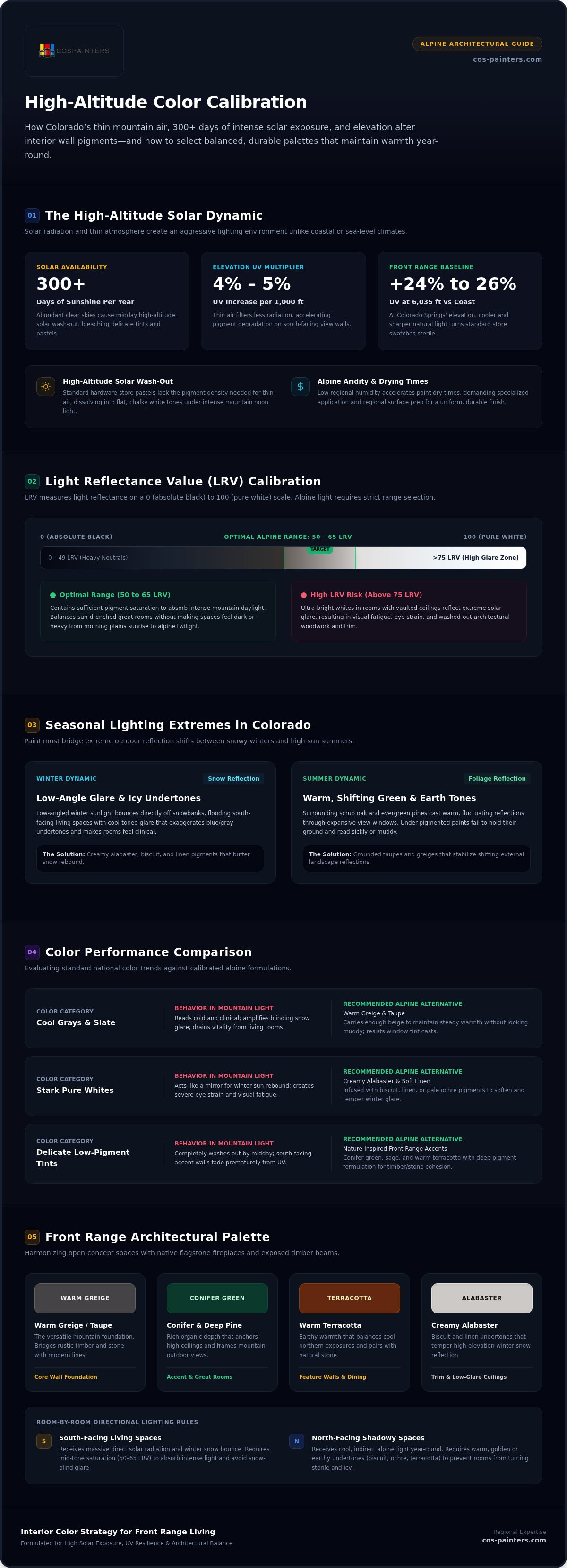
That designer paint swatch that looked perfectly balanced in the store often turns glaring or chalky the second it meets mountain sunlight. Finding the best colors for Colorado homes isn't as simple as following national trends. Between 300 days of annual sunshine and UV exposure that increases by 4 to 5 percent for every 1,000 feet of elevation, our alpine light completely transforms how pigments behave indoors.
If you've watched a favorite wall color wash out by noon or felt your great room turn sterile against a backdrop of winter snow, timber, and stone, you know the frustration firsthand. Your home should feel like a grounded, comfortable sanctuary through every season. You'll discover how Colorado's intense high-altitude sunlight alters interior pigments and how to choose durable, balanced palettes tailored to your architecture. Ahead, we explore calibrated undertones, nature-inspired accents, and practical lighting principles to help you create warm, seamless transitions throughout your living spaces.
Key Takeaways
- Understand how Colorado's thin air and intense solar exposure wash out delicate pigments, requiring strategic undertones to keep living spaces balanced.
- Identify the best colors for Colorado homes by swapping flat, sterile grays for rich greiges and creamy off-whites that maintain warmth in snowy conditions.
- Bring Front Range beauty indoors with nature-inspired accent tones like conifer green, sage, and warm terracotta that pair seamlessly with timber and stone.
- Calibrate interior palettes room by room, tempering bright southern windows while warming up shadowy north-facing spaces.
- Discover how alpine aridity affects paint drying times and why specialized regional preparation ensures a flawless, uniform finish.
How High-Altitude Sunlight Changes Interior Paint in Colorado Homes
Living along the Front Range means waking up to panoramic mountain vistas and more than 300 days of clear blue skies. That abundance of natural light creates an unexpected design hurdle: high-altitude solar wash-out. Thin mountain air filters out far less solar radiation, amplifying daylight intensity indoors and distorting paint swatches that looked gentle in the hardware aisle. Selecting the best colors for Colorado homes requires looking past generic design advice and understanding how our unique regional sunlight interacts with interior pigments.
Throughout the year, this dynamic shifts dramatically. During winter months, low-angled sunlight bounces off blankets of fresh snow, flooding south-facing living areas with intense, cool-toned glare that exaggerates icy undertones. Come summer, surrounding scrub oak and evergreen pine cast warm, shifting reflections through expansive windows. Paint that lacks sufficient pigment depth simply cannot bridge these extreme seasonal swings, leaving rooms feeling either clinical in January or overstimulated in July.
Understanding Elevation and Solar Exposure on Wall Pigments
At Colorado Springs' baseline elevation of roughly 6,035 feet, our homes receive approximately 24% to 26% more UV radiation than coastal properties. This altitude produces a noticeably sharper, cooler natural light. Soft pastels and delicate tints that read as cozy in lower-elevation climates often bleach out into flat, sterile whites by midday. Direct UV penetration through large view windows also accelerates pigment degradation, causing south-facing accent walls to fade prematurely if painted with low-durability formulations.
The Role of Light Reflectance Value in Alpine Environments
To maintain visual comfort, you must consider Light Reflectance Value (LRV), which measures the percentage of light a paint color reflects on a scale from 0 (absolute black) to 100 (pure white).
- High LRV Paints (Above 75): In sun-drenched great rooms with vaulted ceilings, ultra-bright whites reflect excessive glare, causing eye strain and washing out surrounding architectural details.
- Optimal Alpine Range (50 to 65 LRV): Mid-tone neutrals in this range contain enough pigment saturation to absorb intense mountain daylight without making living spaces feel dark or heavy.
Calibrating for elevation ensures the best colors for Colorado homes retain their richness from morning sunrise over the plains to alpine twilight behind the peaks.
Best Neutral Colors for Colorado Homes: Balancing Warmth and Clarity
The nationwide trend toward cool, slate grays often falls flat across Front Range interiors. Under crisp alpine skies, blue-tinted grays read cold and clinical, draining vitality from living spaces. Earthy tans, mushroom taupes, and balanced greiges provide an essential counterweight. In open-concept floor plans, these richer neutrals establish visual cohesion, bridging expansive living areas with native flagstone fireplaces and exposed timber beams.
When selecting the best colors for Colorado homes, choosing between warm and cool foundations impacts your indoor atmosphere through every season:
- Cool Grays and Crisp Whites: Susceptible to looking icy during winter storms; amplify blinding outdoor glare reflected off snow.
- Warm Greiges and Earthy Tans: Absorb midday solar intensity; maintain an inviting, grounded ambiance that complements natural wood and stone.
Finding the right balance requires testing shades in your actual living environment. Scheduling a professional color consultation alongside your next interior painting project can help you identify pigments that harmonize seamlessly with your existing architecture.
Warm Greige and Taupe: The Versatile Mountain Neutrals
Greige bridges contemporary simplicity with rustic Colorado character. While standard gray highlights the chill of a winter afternoon, greige carries enough beige to retain steady warmth without looking muddy. Taupe behaves similarly, providing subtle depth on high walls. These tones stabilize shifting sunlight, resisting the greenish or yellowish cast that often occurs when strong light passes through modern window glazes.
Soft Whites That Resist Winter Glare
Stark, untreated whites create severe visual fatigue in high-elevation settings. When sun rebounds off a snowy front yard, brilliant white walls bounce that light across your living room like a mirror. Instead, opt for soft whites carrying delicate pigments of biscuit, linen, or pale ochre. Creamy alabaster tones temper reflective snow glare while keeping rooms feeling bright and airy. Apply sample swatches directly beside window trim, checking them at noon and again at sunset to ensure the undertone remains consistently warm.
Front Range Inspired Accent Hues: Bringing Regional Beauty Indoors
Expansive picture windows act as dynamic, living art in Rocky Mountain architecture. When selecting accent shades, looking outside your glass provides the clearest guide. Pairing your walls with the native terrain outside creates a seamless visual bridge between your interior living spaces and the surrounding alpine environment. Rather than relying on generic coastal jewel tones, the best colors for Colorado homes draw directly from the geology, sky, and flora defining the Front Range.
Consider how natural regional pigments can enrich specific focal zones:
- Garden of the Gods Ochre and Rust: Warm mineral pigments establish grounded intimacy on fireplace surrounds, entryway vestibules, and formal dining walls.
- Alpine Conifer Greens: Muted spruce, juniper, and sage soothe bedrooms and private studies while harmonizing with native scrub oak hillsides.
- Stormy Mountain Slate: Weathered denim, alpine shadow blues, and granite grays reflect the dramatic cloudscapes that roll off the Continental Divide during summer afternoons.
These organic hues carry natural complexity, ensuring your accent walls remain visually engaging under direct sunlight without competing against the scenery outside.
Conifer Greens and Earthy Sage
Verdant mountain greens bring a restorative quiet into private living quarters. Soft sage and muted olive work exceptionally well along transition corridors, softening the visual shift between indoor drywall and outdoor pine groves. In bedrooms, home offices, and dens, deep spruce tones cultivate a cozy retreat. These botanic shades feature earthy undertones that pair effortlessly with exposed Douglas fir beams, tongue-and-groove pine ceilings, and knotty alder trim common in local homes.
Terracotta, Ochre, and Canyon Warmth
Soaring, vaulted great rooms can occasionally feel cavernous without deliberate color placement. Baked terracotta, canyon clay, and rich ochre introduce immediate warmth, effectively lowering the visual visual height of dramatic ceilings to create an inviting atmosphere. These mineral-rich tones complement the best colors for Colorado homes by establishing natural synergy with native sandstone masonry, dry-stacked river rock, and rustic hardwood floors, keeping your home grounded through winter snows.
Room-by-Room Guide to Choosing Interior Paint in Colorado Springs
Every room along the Front Range experiences daylight differently based on its compass orientation. A paint swatch that looks grounded in a sun-soaked great room can read dingy or flat when applied to a secluded guest room down the hall. Identifying the best colors for Colorado homes means evaluating which direction each window faces and selecting pigment loads designed to balance that specific exposure.
Here is how directional light typically behaves across our local floor plans:
- North-Facing Rooms: Mountain shadows create cool, low-intensity light throughout the year. Counteract this chill with warm creams, biscuit tones, and soft peaches that inject subtle interior warmth.
- South-Facing Rooms: Direct high-elevation sunlight streams in all day. Balance this brilliance with mid-tone neutrals, soft sage, or muted taupe to absorb brightness and avoid eye strain.
- West-Facing Rooms: Late afternoon sun strikes intensely over the Front Range peaks. Cool slates, gentle greiges, and muted off-whites help diffuse strong sunset warmth without visual glare.
- East-Facing Rooms: Crisp morning light fades into indirect shade by afternoon. Balanced neutrals containing slight gold or warm gray undertones keep these rooms bright all day long.
Ready to update your living space with a cohesive palette designed for regional light? Connect with Colorado Springs Painters to schedule an interior painting consultation and explore customized room palettes for your home.
Selecting Proper Finishes for High-Sunlight Rooms
Sheen selection affects how light interacts with wall texture. Matte and eggshell finishes are ideal for large living rooms and open hallways; their low luster hides drywall imperfections under intense, raking mountain light. For active areas like kitchens and mudrooms, satin offers excellent scrubbability without creating harsh reflections. Semi-gloss works best reserved for baseboards, window casings, and bathroom painting, where moisture resistance takes priority over light dispersion.
The 3-Step Sampling Process for Reliable Color Matching
Testing swatches properly protects you from costly repaints. Never paint wet samples directly onto your existing wall, as background color skews your visual perception.
- Step 1: Apply two coats of sample paint onto large, movable foam core boards.
- Step 2: Move the boards around each room, assessing color shifts at 9 a.m., 1 p.m., and sunset.
- Step 3: Lean the boards against hardwood flooring, stone hearths, and cabinetry to confirm undertone harmony.
This structured approach ensures you commit to the best colors for Colorado homes with complete confidence.
Transform Your Colorado Home with Professional Craftsmanship
Selecting the best colors for Colorado homes is only half the battle. Bringing those carefully chosen palettes to life across open living areas demands an understanding of our local climate. Colorado's arid atmosphere and low barometric pressure cause interior paint to flash-dry much faster than at sea level. Without specialized technique, this rapid moisture evaporation leaves behind visible roller stipple, uneven sheen, and lap marks across expansive great room walls.
Achieving a velvety, uniform finish across textured drywall and around exposed timber requires methodical preparation:
- Climate-Tailored Surface Prep: Dry regional air pulls moisture out of wallboard quickly, making thorough cleaning, patch sanding, and dedicated priming vital to ensure lasting paint adhesion.
- Architectural Alignment: Vaulted great rooms and stairwells require precise tape lines and steady brushwork to establish razor-sharp transitions between adjoining colors.
- Seamless Wet-Edge Application: Experienced crews work in synchronized teams, managing application speed so paint doesn't set before adjacent strokes blend cleanly.
Overcoming Mountain Climate Challenges During Application
Indoor relative humidity along the Front Range routinely dips below 20% during cooler months. Under these parched conditions, standard water-based paints can skin over before self-leveling occurs. Professional painters know how to adjust working methods, tool selection, and application pacing to maintain a consistent wet edge. This careful control ensures your final finish looks flawless, whether viewed in the soft glow of morning or under raking afternoon sunbeams.
The Value of Local Colorado Springs Experience
With over 25 years serving the Colorado Springs and Pikes Peak region, our team understands the unique relationship between high-altitude light, regional architecture, and interior finishes. We treat your property with meticulous care, providing clean, punctual service and dependable results that stand up to active mountain lifestyles. Connect with Colorado Springs Painters to schedule your personalized color consultation and find the best colors for Colorado homes tailored to your space.
Bring Balanced Mountain Beauty Into Your Living Space
Choosing the best colors for Colorado homes comes down to understanding how our high-altitude sunlight, seasonal shifts, and rugged geography interact inside your living areas. When you move past flat, sterile grays in favor of grounded greiges, calibrate undertones to directional window light, and embrace earthy accents like conifer green and canyon clay, your home becomes a warm, seamless extension of the Front Range scenery.
Bringing that vision to life requires skilled hands that understand our unique alpine climate and fast-drying conditions. As a locally owned and operated contractor with over 25 years of trusted painting experience across the Pikes Peak area, Colorado Springs Painters brings specialized expertise in regional light adaptation and meticulous surface preparation to every room. Schedule your interior color consultation with Colorado Springs Painters to discover the ideal palette for your space, and enjoy a vibrant, comfortable interior you'll love through every Colorado season.
Frequently Asked Questions
Why do paint colors look so different inside Colorado homes compared to paint chips?
Paint chips are formulated and viewed under artificial fluorescent store lighting, whereas Colorado homes receive intense high-altitude daylight through expansive view windows. Our thinner atmosphere filters less UV and blue-spectrum light, causing paints to reflect 10% to 15% lighter on walls than on a swatch. Hidden undertones like lavender, blue, or yellow also become dramatically magnified once natural mountain sunlight sweeps across a room.
What is the best interior paint color for rooms with intense southern sun exposure in Colorado?
Balanced greiges, soft taupes, and muted sage tones with mid-range Light Reflectance Values around 50 to 60 perform best in south-facing rooms. Among the best colors for Colorado homes with heavy southern exposure, these earthy hues contain enough pigment density to absorb intense solar glare. They temper daytime brightness without flaring into harsh reflection or reading overly brassy under afternoon heat.
Should I avoid pure white paint on interior walls in snowy mountain areas?
Yes, pure, unpigmented whites should generally be avoided on main interior walls in Colorado mountain homes. Winter snowpacks reflect dazzling outdoor sunlight directly into your living spaces, turning stark white walls into blinding surfaces that cause severe eye fatigue. Warm off-whites carrying subtle pigments of biscuit, linen, or pale ochre work much better, keeping rooms luminous without creating a cold, clinical glare.
What paint sheen works best on textured drywall under bright high-altitude sunlight?
Matte and eggshell sheens provide the most flattering finish across textured drywall in sun-drenched Front Range homes. Low-angled alpine sunlight raking across knockdown or orange-peel textures casts micro-shadows that highlight wall flaws. Glossier finishes bounce light unevenly, exaggerating patches and seams. Matte and eggshell diffuse incoming light softly across the wall surface, producing a smooth, uniform appearance that still cleans up easily.
How do I choose an interior paint color that complements natural pine or red oak trim?
Select organic tones like warm greige, soft olive, or muted slate to balance the strong orange and yellow undertones found in native woodwork. Finding the best colors for Colorado homes with exposed pine or oak means avoiding yellow-heavy creams that leave millwork looking dated. Instead, earthy greens, balanced taupes, and gentle canyon clays provide grounded contrast that highlights natural wood grain.
Can low-humidity Colorado air cause interior paint to dry too quickly during application?
Yes, indoor relative humidity dropping below 20% in Colorado causes standard water-based paints to flash-dry within minutes. Rapid surface evaporation prevents acrylic polymers from leveling naturally, leading to visible brush drag and roller lap marks. Seasoned local painting crews overcome this dry climate by maintaining continuous wet edges, regulating room airflow, and coordinating application pace across tall walls for a smooth, streak-free coat.


