

White can make a small room feel brighter and more open, but it isn’t the only effective choice. For making a small room look bigger with paint, consider how the walls, ceiling, trim, and floor work together. Light colors can reflect light, coordinated surfaces can reduce visual breaks, and pale painted floorboards can help the space feel more expansive.
It makes sense to reach for white first, especially in a small bedroom or a room with limited daylight. But the best approach depends on the room’s light, proportions, and existing features. A thoughtful color plan can do more than simply brighten the walls.
Explore five practical ideas, from choosing a suitable shade to using stripes and matching paint across surfaces. You’ll also see how painted floorboards can draw the eye through the room, and how to decide which approach best supports the open, welcoming feel you want.
Key Takeaways
- Coordinate wall, ceiling, and trim colors to create a more continuous look, or use contrast deliberately to emphasize the room’s proportions.
- In a room with little daylight, consider a mid-tone shade instead of assuming white will feel brightest and most spacious.
- Use white walls in a small bedroom to reflect natural light, then add depth with carefully chosen contrast.
- Choose vertical stripes to draw the eye upward or horizontal stripes to make a wall seem longer, and use patterns selectively.
- Try a pale, related neutral on floorboards to reflect light and help lead the eye through the room.
1. Coordinating paint across walls, ceilings, and woodwork
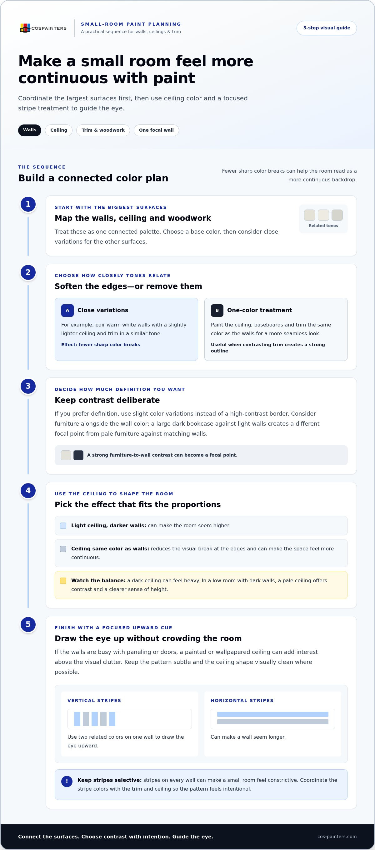
Start with the room’s largest surfaces: walls, ceiling, and woodwork. Choose a base color, then use close variations on the other surfaces to soften the boundaries between them. For example, pair warm white walls with a slightly lighter ceiling and trim in a similar tone. This coordinated palette gives the eye fewer sharp color breaks, helping the walls read as a more continuous backdrop. It’s a practical way to make a small room look bigger with paint without relying on bright white alone.
For a more seamless effect, paint the ceiling, baseboards, and trim the same color as the walls. This single-color treatment can make the room feel more continuous because the eye doesn’t pause at each color change. It can work particularly well when contrasting trim creates a strong outline around a compact room. If you prefer definition, use slight color variations instead of a high-contrast border. Consider the furniture and wall color together, too: a large dark bookcase against light walls creates a different focal point from pale furniture against matching walls.
Ceiling color can change how tall a room feels. A light ceiling against darker walls can make it seem higher, while painting it the same color as the walls can reduce the visual break at the edges. This continuous approach may make the space feel larger, even with darker colors, but a dark ceiling can also feel heavy. Consider the room’s natural light and the effect you want before choosing. In a low room with dark walls, a pale ceiling offers contrast and a clearer sense of height.
The ceiling can also draw the eye upward. In a room with busy walls, such as paneling or several doors, a painted or wallpapered ceiling creates a new area of interest above the visual clutter. A subtle pattern can add movement without competing with every wall. Keep the ceiling’s shape visually clean where possible: a simple rectangular surface has fewer corners and projections to interrupt the view. Crown molding can also guide the eye upward, especially when its color connects with the ceiling instead of forming a strong horizontal band.
Vertical stripes offer another way to emphasize height. Try them on one wall, using two related colors to create a measured pattern that leads the eye upward. Stripes on every wall can make a small room feel constrictive, so choose a single focal wall. In a room with a low ceiling, place the striped treatment where it draws attention upward without crowding the ceiling line. Coordinate its colors with the trim and ceiling so the pattern feels intentional, not like a separate visual block.
2. Choosing mid-tone paint for rooms with little daylight
In a room with almost no daylight, mid-tone paint may feel more spacious than white. White reflects available light, but it can also leave a poorly lit room feeling flat. A soft blue-gray, muted sage, or warm greige gives the walls more depth while keeping the space visually calm. Picture a north-facing reading nook with a muted green wall: the color adds character without the hard contrast of a very dark shade. This subtle effect can help the room feel more welcoming and open.
Choose undertones by looking at the room’s fixed features first. A warm wood floor or honey-colored furniture can make a cool blue-gray seem stark, while a warmer neutral may blend more easily. Compare a green-gray beside the floor and upholstery, not just on a small paint card. Then test the color on a wall and observe it at different times of day. East- and west-facing rooms change from morning to evening, so a shade that looks balanced at one time may appear warmer or cooler later.
Paint sheen also changes how a color reads. A matte finish softens reflections and can make a wall’s color feel even, while a glossier surface reflects more light and highlights surface details. On an older wall with visible texture, a low-sheen finish can keep attention on the overall color rather than every bump. On a smooth surface, a modest sheen can add brightness. Compare finish samples beside the chosen color, since the same shade can look different as its surface reflects light.
Window treatments can help a room feel taller. Hang a curtain rod close to the ceiling, then let the panels fall toward the floor. This draws the eye upward and gives the window more visual height. Choose sheer or lightweight fabric where privacy allows; it softens the window without blocking as much natural light as heavy drapes. In a narrow room, keep the curtain color close to the wall color to reduce a strong visual break around the window.
A mirror can make a dim space feel more open by reflecting the view and amplifying daylight. Place it opposite or beside the window, where it can catch light rather than reflect a cluttered corner. Pair that placement with a mid-tone wall color and a simple furniture arrangement, such as a low-backed chair that leaves more wall visible. These choices work together: paint gives the room depth, sheer curtains preserve light, and the mirror extends the view. A thoughtful interior color plan can bring those elements together.
3. Using white walls to make a small bedroom feel more open
Light colors generally make a room appear larger than dark colors because they reflect more light. In a small bedroom, white, off-white, pale blue, and cool green can create a brighter, more open effect. White walls work especially well when daylight reaches the room, but the best shade also depends on the floor, bedding, and other fixed colors. Warm off-white beside honey-toned wood, for example, can feel more connected than stark white.
Start by looking at the light and colors already in the bedroom. If the room has white bedding and pale flooring, white walls can form a calm backdrop that lets those pieces blend together. For a softer effect, choose pale blue or cool green, then repeat the color in a cushion or small accessory. Test a paint sample on the wall beside the bed and observe it alongside the bedding. This simple step shows how the shade works with the room’s actual surfaces.
Matching the trim and baseboards to the walls can reduce visual breaks around the room. Paint the door trim, baseboards, and walls in the same white or pale shade to create a continuous line. A contrasting dark border can outline each wall and draw attention to the room’s edges. If the bedroom has several doors or a closet frame, matching those details to the walls helps them recede instead of competing for attention.
For visual depth, use an accent wall to give the eye a focal point. In a compact bedroom, the wall behind the headboard is a natural choice. Muted blue or green can add dimension there while the remaining walls stay light. The contrast can create an illusion of extra space, especially when the bed and surrounding pieces don’t crowd the view. Keep the accent shade connected to the room’s palette, such as a soft green wall with off-white bedding.
White walls can make darker furniture stand out, adding depth without covering every surface in a bold color. A walnut bed frame or charcoal nightstand against white creates a clear focal point, while pale walls keep the overall room bright. Balance contrasting pieces with light bedding and an uncluttered bedside surface. If the bedroom has a small window, keep its trim close to the wall color so the frame doesn’t divide the wall into more visual sections.
4. Horizontal and vertical wall stripes
Stripes use direction to change how a wall seems proportioned. Horizontal bands can make a short wall appear longer, while vertical stripes draw the eye upward and make a low ceiling feel higher. Horizontal stripes on the end wall of a narrow room, for example, can emphasize its width. In a room that feels squat, a vertical pattern on one focal wall can strengthen the sense of height. Choose the direction to suit the room’s main challenge.
Color contrast determines how strongly a pattern catches attention. Two close shades, such as soft gray and pale gray, create a quieter effect than navy and white. In a compact room, restrained contrast can add movement without making the walls dominate. A bold combination may suit one feature wall, especially behind a bed or sofa. Keep the remaining walls simple so the pattern has room to breathe.
Plan the stripe placement before opening the paint. Choose a focal wall, then decide whether its lines should run horizontally or vertically. Mark the pattern with a level and painter’s tape, and check the lines from the doorway. For a vertical design, align the stripes with a clear architectural feature, such as a doorframe. For horizontal bands, consider how they meet shelves, windows, or furniture. A stripe interrupted by a large bookcase may lose its visual flow.
Painting every wall with stripes can make a small space feel constrictive. A single striped wall often gives the eye a clear direction without adding pattern everywhere. In a room with open storage, shelves, books, and baskets already create visual clutter; a quieter striped wall can balance those details. If the room has patterned bedding or a busy rug, choose subtle stripe colors that relate to an existing color. This keeps the contrast deliberate rather than competing.
The ceiling can support the same upward movement. In a room with vertical stripes, keep the ceiling light or close in color to the wall’s lighter shade. You can also paint the ceiling a pale color to maintain an open transition above the pattern. Avoid carrying strong stripes across both walls and ceiling, since extra lines may crowd the view. For a long, narrow room, reserve horizontal stripes for a shorter wall, then use simple colors elsewhere. This lets the directional effect support the room’s proportions without adding unnecessary visual noise.
5. Painting floorboards to elongate a room
Floorboards are often overlooked, yet their color changes how the whole interior reads. A pale, related neutral can reflect light across the floor and help a room feel larger. Soft beige boards paired with warm off-white walls, for example, create a connected view from floor to wall. Dark boards, by contrast, visually ground the space and can make the floor more prominent. Choose the effect that suits the room’s purpose, such as an airy guest room or a cozy den.
Board direction can also guide the eye. Long boards running from the doorway toward a window lead the view through the room, supporting an elongated impression. If the boards run across a narrow room, their lines emphasize width instead. Consider the room’s proportions and the entrance location before settling on a color and finish. Vertical stripes on walls can draw attention upward, while the floor’s lines create a separate visual path. Keep those directions working together, not competing.
Before painting, clear the floor and inspect the boards for loose paint, dirt, or damage. Clean the surface, prepare it according to the paint directions, and protect the edges where boards meet trim. A sample patch helps show how the color looks beside the walls and furniture. View it in daylight and under the room’s evening lighting. A pale floor that looks bright by the window may appear warmer beside a wood bed or rug.
Choose the shade in relation to existing surfaces, not in isolation. A cool gray floor can feel disconnected beneath warm cream walls, while a warmer pale neutral may link the two. If the room already has bold furniture or a patterned rug, a quiet floor color keeps the visual field from feeling busy. In a simple interior, stronger floor contrast can become a deliberate feature. Either way, aim for clear visual flow, not a floor that draws attention away from the room.
For the paint amount, measure the floor area and use the product’s stated coverage per coat to estimate what you’ll need. The required coats depend on the paint directions and surface condition: bare boards or a strong color change need more coverage than sound boards with a similar existing color. Keep the same product and finish across the floor for a consistent result. If you’re ready to refresh the boards as part of a wider room update, plan your interior painting around the floor color and the rest of the space.
Colorado Springs Painters: Interior Painting
Colorado Springs Painters provides Interior Painting for rooms that need a cohesive, carefully finished color plan. If you’ve chosen a lighter wall shade, coordinated trim, or painted floorboards, bringing those decisions together can help your small room feel more open. Interior painting is a natural next step when you’re ready to move from ideas and samples to refreshing the room’s surfaces. Share the colors and visual effect you have in mind, whether that’s a bright bedroom, a more continuous wall-and-ceiling palette, or a subtle accent wall. Thoughtful application helps your chosen colors work as one complete interior. Contact Colorado Springs Painters to discuss your interior painting project.
Plan a Room That Feels Like Yours
Making a small room look bigger with paint is one goal; creating a room you enjoy living in is the lasting one. Before settling on a color, think about how the space should feel during an ordinary day. A bedroom might call for a restful backdrop, while a work area may benefit from a brighter, more energizing mood. Let that purpose guide your final choices so the finished room feels considered, not simply decorated.
When you’re ready to put your plan into action, Colorado Springs Painters offers Interior Painting for residential spaces, along with Exterior Painting and Commercial Decorating. A carefully finished paint job can bring your chosen palette together and help your room feel refreshed. Contact Colorado Springs Painters today to take the next step toward a more comfortable, welcoming space.
Frequently Asked Questions
But what about white?
White can make a small room feel bright, but it isn’t automatically the best fit for every space. In a bedroom with strong daylight, clean white can keep the look crisp. In a dim room, softer off-white may feel more comfortable against wood floors or warm bedding. If white feels too stark, use it on the trim or ceiling, then choose a gentle color for the walls.
Should walls, ceiling, and trim be painted the same color in a small room?
They can be, especially if you want fewer visible boundaries around the room. Matching the walls, ceiling, and trim can work well in a small entryway or a room with multiple doorframes. For more definition, stay within the same color family but vary the shades slightly. Consider existing features, too: a bright white door against creamy walls will stand out, while a close match will blend in.
What ceiling paint color makes a small room feel taller?
A light ceiling color usually helps a small room feel taller, particularly when the walls are darker. Soft white, pale gray, or a light pastel can make the ceiling seem less visually heavy. In a room with pale walls, matching the ceiling can create a continuous look instead. Check the ceiling color beside the wall shade, since strong contrast can draw attention to the boundary.
Do glossy or matte paint finishes make a small room look bigger?
Neither finish automatically makes a room feel bigger; the surface and lighting matter. Glossy paint reflects more light, which can add brightness on smooth trim or a well-prepared feature. It can also make dents and uneven patches more noticeable. Matte paint softens reflections and suits walls with visible texture. In a small room, choose a finish that suits the surface rather than relying on sheen alone.
How can accent walls affect the perceived size of a small room?
An accent wall gives the eye a focal point, which can add depth without introducing color everywhere. In a narrow living room, a deeper shade on the wall behind the sofa can draw attention to that end of the space. Keep nearby walls and large furnishings simple so the feature remains clear. A very strong accent on multiple walls may make the room feel visually busy.
How should paint color work with natural light in a small room?
Choose a shade by observing the room at different times of day. East-facing rooms receive changing morning light, while west-facing rooms shift as evening approaches. A warm neutral may look balanced in cooler daylight but become more golden later. Test a sample near the window and another on a shaded wall. Comparing both spots helps show how the same color behaves across the room.
What paint colors make a small room look bigger with little natural light?
Mid-tone shades such as muted sage, soft blue-gray, and warm greige can give a dim room more depth than stark white. Choose an undertone that relates to the floor and furnishings; warm greige, for example, can sit comfortably with honey-toned wood. Keep large surfaces in a coordinated palette, then add brighter accents through bedding or artwork. This makes the colors feel intentional rather than gloomy.
What painting techniques make a small room look larger?
A useful approach to making a small room look bigger with paint is to choose a technique that suits its proportions. Use vertical stripes to emphasize height, horizontal stripes to visually extend a wall, or coordinated colors to reduce visual breaks. A pale floor can also carry the eye through the space. Choose one main effect, then keep other painted surfaces calmer to avoid competing patterns.


