

Retail color trends can spark ideas, but they should not outweigh your brand identity or the mood you want shoppers to experience. A considered approach to paint color psychology for retail customer experience starts with your brand, then uses color to make entrances feel welcoming, aisles feel open, and service counters feel calm.
Popular palettes can offer inspiration when your store needs a refresh. But a trending shade may feel out of place if it clashes with your merchandise, lighting, or the experience customers expect.
This guide explains how color can shape shoppers’ emotions and perceptions, and why the same shade can feel different depending on context. Learn how to choose a palette that supports your brand, where to use color in key store areas, and how to balance expressive accents with a backdrop that lets products stand out.
Key Takeaways
- Start with your brand identity and merchandise, then choose a palette that supports both rather than following trends alone.
- Use color as an atmosphere-setting tool, while keeping shopper responses and the store’s lighting in mind.
- Balance expressive shades with quieter backdrops so displays remain the visual focus.
- Give each area a clear role: create a welcoming entrance, make narrow aisles feel open, and keep service counters calming.
- Consider how paint finish, wall condition, and everyday wear affect the look and upkeep of your retail space.
Choosing colors based on brand, industry, and subject matter
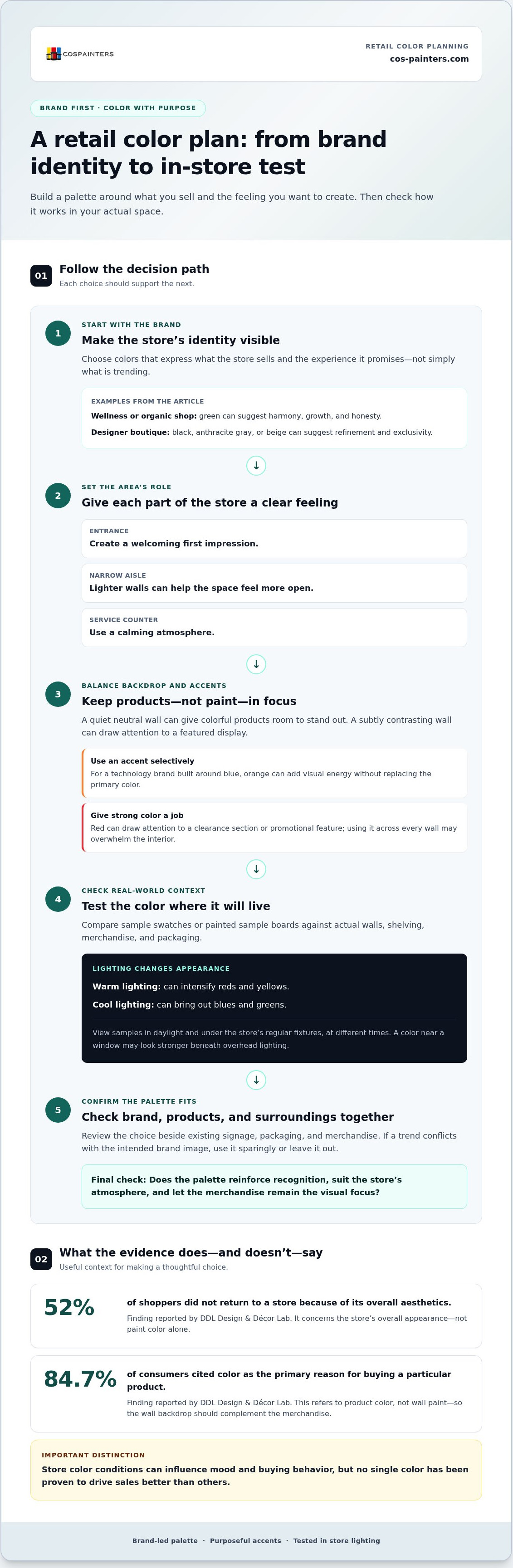
A store’s palette should make its intended brand identity visible, whether that means leafy green in a wellness shop or a charcoal backdrop in a designer boutique. Common missteps include following a trend that clashes with the brand, overpowering merchandise, or choosing a shade without considering shoppers and product packaging.
Aligning Paint With Brand Identity
Align paint with your brand by choosing colors that express what the store sells and the experience it promises. A disconnected visual environment can make the customer experience feel less cohesive. Compare a youthful, sporty shop with vivid colors and bold contrasts to a calm, premium store with restrained tones. In each case, the palette should reinforce the intended impression, not distract from it.
Green for Natural and Wellness Brands
Green can suit shops focused on wellness, organic goods, or ecological values because it may suggest harmony, growth, and honesty. That association can connect the room’s visual character with merchandise such as plant-based skincare or reusable household goods. Choose a shade that complements the packaging and brand palette. Muted green can support a restful setting, while a brighter accent can add energy to a display.
Trends can inspire, but they should not dictate a store’s identity. A pop-up shop, for example, can use a current accent color while keeping its core palette consistent with its online presence. That continuity helps shoppers recognize the brand across settings. Before adopting a trend, compare it with existing signage, packaging, and merchandise. If the shade conflicts with the brand’s intended image, use it sparingly or leave it out.
Fashion-store palettes can reflect different brand positions. A designer boutique or jeweller might use black, anthracite gray, or beige to suggest refinement and exclusivity. Menswear stores may pair gray, navy blue, and brown for a composed, professional impression. Pink can suit boutiques and cosmetics shops aiming for a sweet, feminine image. Youthful or sporty labels can use vibrant color and bold contrast, while shops selling higher-priced personalized goods may suit a more timeless atmosphere.
Let the merchandise guide the final choice. A neutral backdrop gives colorful clothing, cosmetics, or accessories room to stand out; a subtly contrasting wall can draw attention to a featured display. For a technology brand built around blue, an orange accent may add visual energy without replacing the primary color. Review the palette beside actual products and packaging, then consider how store lighting changes its appearance. The strongest choice supports recognition and keeps the products, not the paint, in focus.
Effects of store color on shopper mood and buying behavior
Color shapes shoppers’ first impressions, influences a store’s atmosphere, and can affect how merchandise is perceived. Paint color psychology for retail customer experience depends on context, including lighting, layout, and the colors surrounding a product.
Color and First Impressions
Color and first impressions describe how a store’s palette shapes shoppers’ initial perception of its interior. That impression matters because a polished, coordinated space can make products feel more appealing, while a neglected-looking one may distract from them. DDL Design & Décor Lab found that 52% of shoppers did not return to a store because of its overall aesthetics. A coordinated entrance and display area can help the space feel intentional.
Color can also influence product choice: DDL Design & Décor Lab found that 84.7% of consumers cited color as the primary reason for buying a particular product. That finding concerns product color, not wall paint alone. Still, it shows why a paint backdrop should complement merchandise. For example, a quiet neutral wall can let vivid packaging draw attention instead of competing with it.
Red, Attention, and Purchasing
Red draws attention and can add urgency to a retail display. It can help shoppers notice a particular area, such as a clearance section or promotional feature. A red accent can distinguish that display from nearby merchandise, while red across every wall may overwhelm the interior. Use it with purpose, so the visual cue supports a purchase decision rather than interrupting browsing.
Color is not a reliable shortcut to higher sales. Research published in Psychology & Marketing found that store color conditions influenced shoppers’ moods and buying behavior, but no single color has been proven to drive sales better than others. The same shade can prompt different responses in different settings. Red may feel energetic in one display but overpowering beside crowded shelves or intense lighting.
Lighting changes how paint colors appear. Warm lighting can intensify reds and yellows, while cool lighting can bring out blues and greens. Test a paint sample on the actual wall and view it under the store’s natural and artificial lighting at different times. A color that looks balanced near a window may appear stronger under overhead fixtures.
Walls, Ceilings, and Perceived Space
Wall and ceiling colors influence how spacious and comfortable a store feels. Lighter colors can make a small retail area feel more open, while darker or more saturated tones can create a more intimate atmosphere. In a narrow aisle, lighter walls can reduce a closed-in impression. Softer colors may encourage a more relaxed visit, though shopping time also depends on layout, merchandise, and service.
Retailers applying paint color psychology for retail customer experience can compare sample swatches or painted sample boards against actual walls, shelving, and merchandise before repainting. View them in daylight and under the store’s regular fixtures, then move the samples to the entrance, aisle, and display areas. This practical test can reveal clashes before committing to a full-room color. For a carefully planned refresh, professional interior painting can help bring the chosen palette together.
Emotional associations of red, blue, yellow, green, black, and white
Color can cue emotions and shape how shoppers perceive a brand’s quality, price, and personality. These associations can guide design choices, but context and culture affect how each palette feels.
Color Associations With Quality and Trust
Color associations are the meanings shoppers attach to a store’s visual choices, including trust, value, and exclusivity. A mismatch can weaken the brand identity a retailer wants to communicate. Blue often conveys calm and reliability, making it useful for brands seeking to build trust. Black can suggest strength, class, and high-end positioning, while neutral gray can let merchandise signal quality.
Consider the full setting, not just one color. Navy walls may support a composed image in a menswear store, while black display areas can frame premium accessories. Bright red can draw attention to a promotion, but too much may feel overwhelming. No shade carries a fixed price message on its own. Shoppers interpret color alongside materials, lighting, signage, and displayed products.
Green is associated with nature, environmental values, and growth, so it can suit wellness shops or retailers focused on sustainable goods. A muted green wall behind natural skincare can reinforce those cues without competing with the packaging. Pairing green with wood-toned displays can strengthen a nature-led atmosphere, while a vivid green accent can feel more energetic. Match the shade to the brand’s character and the merchandise it frames.
Yellow, Optimism, and White Contrast
Yellow can communicate optimism and attract attention, while white often makes a store feel clean, bright, and spacious. This contrast is useful when a retailer wants to highlight a feature without making the entire interior feel busy. A soft yellow accent might draw shoppers toward new arrivals against a white wall. Use yellow selectively, since too much can cause visual fatigue and its associations vary across cultures.
Contrast also affects readability. Yellow text generally has low contrast against a white background, so avoid that pairing for most store text. Instead, use yellow for a wall accent or display detail, with darker lettering on signs. A clear visual hierarchy helps shoppers notice the feature and read its message easily.
Purple can support a soothing impression for North American shoppers, and brands may use it as an accent for a distinctive, prestigious presentation. Its meaning is not universal, so consider the target audience and the surrounding palette. Australian freelance design services platform 99designs identified purple, brown, and pink among retailers’ least popular colors. That finding is a prompt to use purple deliberately, not a reason to rule it out.
For a strategic palette, choose each shade for a purpose: blue for calm and trust, green for natural cues, and black for a refined display. Use red or yellow where focused attention helps, and leave white or neutral areas for visual breathing room.
How store color choices can shape customer emotions and perceptions
Color shapes how shoppers perceive a store’s atmosphere, move through its layout, and respond to displays. Effective design balances product visibility, clear zones, and the target audience’s expectations.
Color Changes Between Store Zones
Using different colors by zone means giving areas distinct visual cues within one coordinated store. This can help shoppers recognize browsing, fitting, and checkout areas without relying only on signs. A warm entrance can feel inviting, while a calmer service counter can support a more relaxed interaction.
For example, use a subtle contrasting shade behind a featured display, then carry a related accent toward the fitting rooms. Keep transitions deliberate: a sudden shift from pale neutrals to intense orange may feel disconnected. Color can also support the store layout, helping shoppers notice a new-arrivals wall while keeping the main merchandise prominent.
The 80/20 Color Balance
The 80/20 approach uses neutrals for about 80 percent of a store’s color scheme and accents for the remaining 20 percent. It matters because a neutral foundation gives merchandise room to stand out, while selective contrast adds visual interest.
A clothing shop might use warm gray across most walls, then add a stronger color near a seasonal display. Treat this balance as a design guide, not a fixed formula. In a compact store, a restrained palette can reduce visual competition; a bold brand may need more accent color to express its identity.
Color in Store Design and Layout
Color in store design is the planned use of paint and visual contrast to support movement, displays, and the room’s overall impression. It can help shoppers focus without letting décor compete with products.
Consider a blue-and-neutral interior with a small orange accent near a feature display. The contrast can draw attention to the area while keeping the broader layout composed. Lighting changes how colors appear, so assess the palette beside shelving and merchandise under the store’s actual fixtures. This can prevent an accent from looking unexpectedly bright or dull.
Color Effects Across Customer Groups
Color effects vary across cultures, ages, and genders, so the target audience should inform palette choices. Younger shoppers may respond well to bold colors, while older shoppers may prefer subtler palettes. Blue may appeal to both men and women, with men showing the strongest preference for it.
Cultural context matters too: white is associated with marriage in Western societies and with death in China. These differences show why a palette suited to one audience may carry a different meaning elsewhere. Pastel pink, mint, and sky blue can suit children’s fashion stores, while earthy or warm neutrals can create a modern feel in adult women’s fashion. Align color choices with the shoppers and merchandise the store serves.
Paint colors for entrances, aisles, and service counters
Color can give each retail zone a clear purpose, from welcoming shoppers at the entrance to making checkout feel calmer. A coordinated scheme helps those changes feel intentional rather than disconnected.
At the entrance, warm paint tones can convey welcome and encourage shoppers to step inside. Soft terracotta or warm neutral around the doorway can create a friendly first impression without competing with window displays. If seasonal merchandise is also featured, use a restrained accent behind it. Keep surrounding walls quieter, so the entrance feels inviting rather than crowded.
Narrow aisles and low-ceiling areas can feel more open and less confined with lighter paint colors. Pale walls also help shoppers see merchandise clearly when shelving creates strong lines and shadows. For example, a light neutral aisle with a coordinated color at the end can guide attention forward. Avoid a series of bold, contrasting wall colors, which may make a compact route feel busy.
Service counters and registers benefit from a calmer visual impression. Soft blue, muted green, or gentle neutral tones can balance the activity of queues, screens, signage, and product displays. A calming backdrop can make the area feel composed, while a bright feature wall may add unnecessary visual pressure. Keep the counter easy to locate through clear layout and signage, rather than relying on a loud paint color alone.
Use color changes to clarify the store’s layout. A subtle contrast behind a featured display can distinguish it from adjacent merchandise, while a related shade near fitting rooms can mark a transition. The scheme should still connect each zone to the overall brand. Repeating one accent in small details, such as a display wall and fitting-room entrance, can create balance without making every area look identical.
Lighting can change how paint looks across these zones. Warm fixtures intensify reds and yellows, while cooler lighting brings out blues and greens. Compare samples on the actual entrance, aisle, and counter walls under the store’s usual lighting. A yellow that feels welcoming by a sunlit entrance may appear too strong beneath warm overhead lights. Check each shade beside displays and packaging before using it across a larger area.
Give the busiest walls practical consideration, too. Entrances, narrow aisles, and counters often see regular contact, so paint selection should account for traffic, cleaning, and wear. A consistent, well-maintained finish helps the color scheme continue to convey care throughout the store. For help bringing a retail palette together, plan your commercial decorating project.
Colorado Springs Painters: Interior Painting
Colorado Springs Painters brings retail color plans to life through Interior Painting and Commercial Decorating. Turn to the team when your chosen palette needs careful application across entrances, aisles, feature walls, or service counters.
A thoughtful refresh can create clear transitions between store zones while keeping merchandise in focus. For example, a coordinated accent wall can draw attention to a display, while a lighter aisle palette can support a more open feel. Careful surface preparation and a considered finish help the completed space reflect your design intent.
Whether you’re updating one area or refreshing the broader retail interior, Colorado Springs Painters can help shape the space around your goals. Contact Colorado Springs Painters to discuss your retail painting project.
Turn Your Color Plan Into a Cohesive Retail Space
Treat paint color psychology for retail customer experience as a design brief, not a search for one perfect shade. Note what shoppers should notice first, how each area should feel, and which merchandise needs visual breathing room. Then compare those goals with the colors already present in displays, signage, and packaging.
Once the direction is clear, a professional finish can carry the palette consistently across the space. Colorado Springs Painters offers Interior Painting and Commercial Decorating for retail environments, helping bring a considered color plan to life.
Contact Colorado Springs Painters to discuss your retail painting project. A well-planned palette can give your store a more welcoming, purposeful feel, and the right next step can begin with a clear conversation about your space.
Frequently Asked Questions
How do paint colors influence retail customers’ emotions and buying behavior?
Paint can set an emotional tone that shapes how shoppers approach displays and perceive products. A calm atmosphere may suit browsing that involves comparing options, while a lively accent can make a feature area more noticeable. Color works alongside product arrangement, signage, and service, so view it as one influence on the shopping experience, not a sales guarantee. In Colorado Springs, retailers can assess their store layout and customer responses.
What does color psychology research say about red, blue, green, and other store colors?
Research points to context-dependent associations rather than a universal color formula. Red can attract attention, blue is often linked with calm and trust, and green can suggest nature or wellness. Psychology & Marketing reports that store color conditions influenced shoppers’ moods and buying behavior. For practical decisions, compare how a color looks beside actual products, signage, and surrounding surfaces rather than relying on its name alone.
Which paint colors work best for different retail sectors and product categories?
The right palette depends on the brand’s position and the products it needs to frame. A wellness retailer might use natural greens; a designer accessories shop could use restrained dark neutrals; and a children’s clothing store might choose soft pastels. Consider product colors, packaging, and materials together. If merchandise already has vivid prints, for example, quieter walls can keep each item easy to see without creating visual competition.
How should retailers choose paint colors for their target audience and brand identity?
Start by defining the impression your store should create, then compare candidate colors with your brand materials and merchandise. Audience expectations matter: cultural associations and preferences can vary across customer groups. A Colorado Springs shop serving a particular community can consider local customers’ tastes alongside its online branding. Before choosing a full-room palette, view samples near signs, displays, and product packaging to make sure the combined effect feels consistent.
What research measures the effect of retail color on sales, conversion, and customer experience?
Published research examines how store color conditions relate to shoppers’ moods and buying behavior. Psychology & Marketing reports effects on both; a review in Management Decision discusses how hues can shape consumer attitudes and purchasing behavior. To evaluate a store’s results, compare customer feedback and sales patterns across comparable periods or areas, accounting for changes in merchandise, promotions, and layout. This helps distinguish color’s possible influence from other factors.
How do lighting and paint finish change the appearance and psychological effect of store colors?
Lighting changes how a painted surface looks: warm illumination can intensify reds and yellows, while cool illumination can bring out blues and greens. Finish also affects reflected light and how a wall appears beside glossy packaging or matte displays. View paint samples under the store’s usual fixtures and daylight, then compare them near merchandise. For busy walls, consider contact, cleaning, and wear when selecting a practical finish.


